New look for Imade3D web
(2021)
It’s always so pleasing when somebody likes my work and ping me if I will not have time to help them with something. Of course, I did! And it was a great time to work on a redesign for Imade3D two pages on their website!
Imade3D is a producer of a very special 3D printer - JellyBOX, designed for children and everybody who would be interested in learning how to print and to build their own 3D printer. The machine is completely transparent so you can see how each part works. The whole construction is held with zip ties for easy build and disassembling. Yep, you read it right, zip ties. And it works perfectly!
The assignment
The goal was to redesign two of the most important pages at the clinet’s website - the index page (main) and the subpage for the newest product. The number of new materials was limited and the printer looked visually the same as previous iterations. Challenge accepted!
I know the company well for a few years so it was relatively quick and I really enjoyed rearranging all the information which needed to be delivered to the audience with a nice fresh & juicy twist!
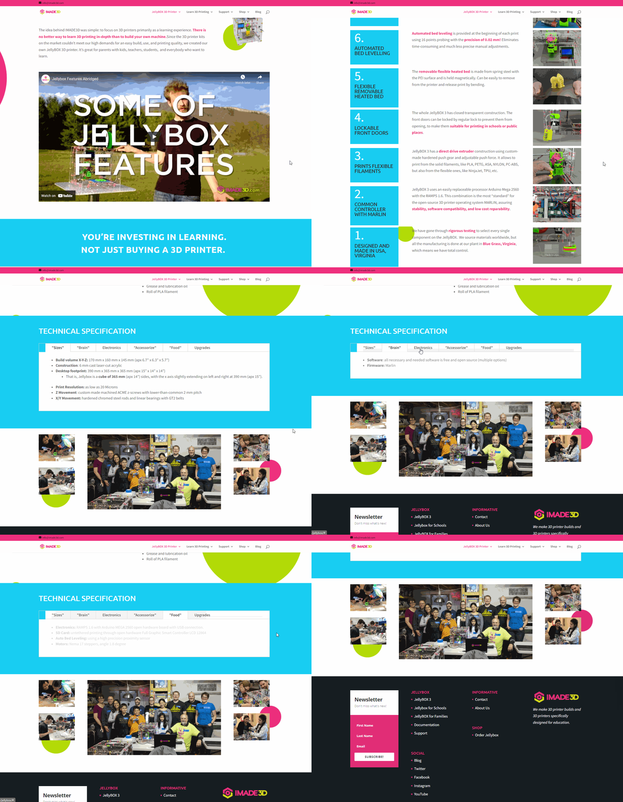
Now you can find there a very clean design, easy to find your way around UX, and funky dots for enhancing the mood : )
I love the colors of JellyBox, was a blast to work with them!
Lightly moving background dots for a pleasant movement feeling (parallax)
Images of the printer weren’t cleaned from the “grey“ background to keep it looking like stickers
Added space to communicate also the shop offer and news & blog
Also, they had a lot of awesome photos from assembling workshops, take a look


